
Wednesday, 10 March 2010
The Logorama, Oscar 2010 best animated short film
Check out the Logorama Oscar 2010 best animated short film here!
Tuesday, 9 March 2010
Coca Cola vs. Pepsi
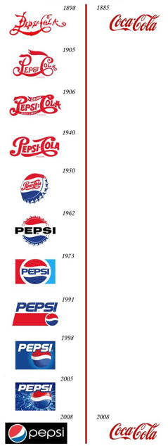
The best known history line of logo design must be the comparison between Coca Cola and Pepsi. But is it a truthful comparison? This picture got around a few years ago and has after that been much talked of on blogs and forums. It's a timeline that shows the evolution of the logos of both companies from the late nineteenth century to this day. It lets us understand that where Pepsi logo has changed through years, Coca Cola's has remained the same. This timeline might wittily suggest that only the best things last forever. The comparison is a disgrace to Pepsi's fickle and constantly varying logo next to Coca Cola's ever-lasting design.
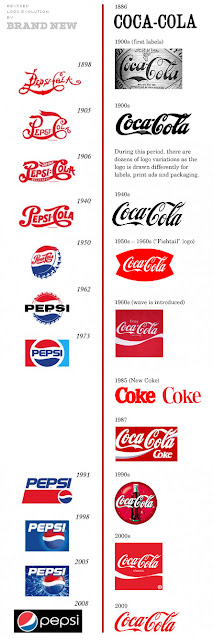
Coca Cola's brand has stayed remarkably unchangeable but there have been changes through years. The company started out in 1886 and the brand name first appeared in the Atlanta Journal Constitution the same year in sans serif. The so well-known logo was outlined only in 1887 by Coca Cola's bookkeeper Frank Robinson. During the first decades the script logo got different variations as it was traced over and over again. It isn't until the 1930's and 1940's that a clear interpretation of the logo appears and is used consistently in Coca Cola marketing and branding.
One of the biggest changes in the Coca Cola identity must be the "fish tail" logo used in 1950's and 1960's, in which the script logo is placed within a red shape. Also the wave which nowadays can be seen in almost every logo of every company was introduced in the 1960's to the traditional script style logo.
A more remarkable identity change was the year 1985's total marketing failure when the company tried to launch in United States a completely new Coca Cola taste introducing "New Coke". The idea was to beat Pepsi which had in late seventies, early eighties started to outsell Coke in supermarkets, as the new generation favored Pepsi and it's sweetness. The reaction to the change of taste was poor, and the original formula was reintroduced re-branded as "Coca Cola Classic" in less than three months. This resulted in a significant gain in sales.
 The company's chief marketing officer, Sergio Zyman sums it up:
"Yes, it infuriated the public, cost a ton of money and lasted only 77 days before we reintroduced Coca-Cola Classic. Still, New Coke was a success because it revitalized the brand and reattached the public to Coke."
It has been later speculated that the whole "New Coke marketing blunder" was created on purpose to upset the consumers, grow the demand for the original product and to conceal the changes in the taste of the original product as the final derivatives of coca were removed from the product.
Thank you for Brand New for the chart!


The time line is funny and memorable indeed, and strengthens the already strong image of Coca Cola's triumphing victory over Pepsi throughout years whereas Pepsi struggles with new brand images decade after decade. And it's true that the best designs last unaffected by time. Coca Cola's hasn't, though.
One of the biggest changes in the Coca Cola identity must be the "fish tail" logo used in 1950's and 1960's, in which the script logo is placed within a red shape. Also the wave which nowadays can be seen in almost every logo of every company was introduced in the 1960's to the traditional script style logo.
A more remarkable identity change was the year 1985's total marketing failure when the company tried to launch in United States a completely new Coca Cola taste introducing "New Coke". The idea was to beat Pepsi which had in late seventies, early eighties started to outsell Coke in supermarkets, as the new generation favored Pepsi and it's sweetness. The reaction to the change of taste was poor, and the original formula was reintroduced re-branded as "Coca Cola Classic" in less than three months. This resulted in a significant gain in sales.

"Yes, it infuriated the public, cost a ton of money and lasted only 77 days before we reintroduced Coca-Cola Classic. Still, New Coke was a success because it revitalized the brand and reattached the public to Coke."
It has been later speculated that the whole "New Coke marketing blunder" was created on purpose to upset the consumers, grow the demand for the original product and to conceal the changes in the taste of the original product as the final derivatives of coca were removed from the product.
Thank you for Brand New for the chart!

Lasting Logo Design
Ranking good and bad designs, logos and idents, one of the indicators could be how long the logo is usable before it must be completely renewed. Naturally some minor changes are due to new technology to even the best of logos. Here are some of the ever-greens and ever-changing: Coca Cola, Alfa Romeo, Apple, Aston Martin, BMW, Esso, FedEx, Ford, GE, IBM, Lego, Nike, Peugeot, Renault, Shell, Siemens, Starbucks, WWF, McDodald's, Best Western, Bassetti...


I was going to include McDonald's in the category of never-changeing logos but apparently McDonald's – among several other companies – is going green.


The logos are all around in our environment and shape our way of thinking and observing our surroundings. And the latest prove of that is the 2010 Academy Award winner for the Best Animated Short Film, Logorama.

Subscribe to:
Posts (Atom)


