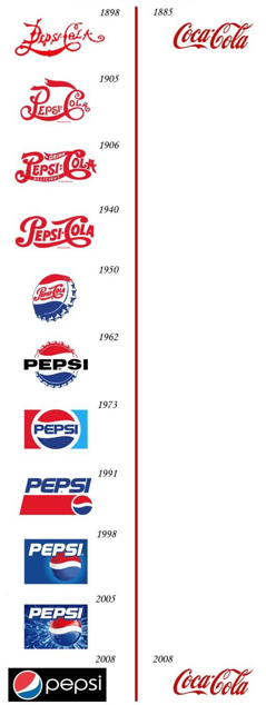
The time line is funny and memorable indeed, and strengthens the already strong image of Coca Cola's triumphing victory over Pepsi throughout years whereas Pepsi struggles with new brand images decade after decade. And it's true that the best designs last unaffected by time. Coca Cola's hasn't, though.
One of the biggest changes in the Coca Cola identity must be the "fish tail" logo used in 1950's and 1960's, in which the script logo is placed within a red shape. Also the wave which nowadays can be seen in almost every logo of every company was introduced in the 1960's to the traditional script style logo.
A more remarkable identity change was the year 1985's total marketing failure when the company tried to launch in United States a completely new Coca Cola taste introducing "New Coke". The idea was to beat Pepsi which had in late seventies, early eighties started to outsell Coke in supermarkets, as the new generation favored Pepsi and it's sweetness. The reaction to the change of taste was poor, and the original formula was reintroduced re-branded as "Coca Cola Classic" in less than three months. This resulted in a significant gain in sales.
The company's chief marketing officer, Sergio Zyman sums it up:
"Yes, it infuriated the public, cost a ton of money and lasted only 77 days before we reintroduced Coca-Cola Classic. Still, New Coke was a success because it revitalized the brand and reattached the public to Coke."
It has been later speculated that the whole "New Coke marketing blunder" was created on purpose to upset the consumers, grow the demand for the original product and to conceal the changes in the taste of the original product as the final derivatives of coca were removed from the product.
Thank you for Brand New for the chart!


